
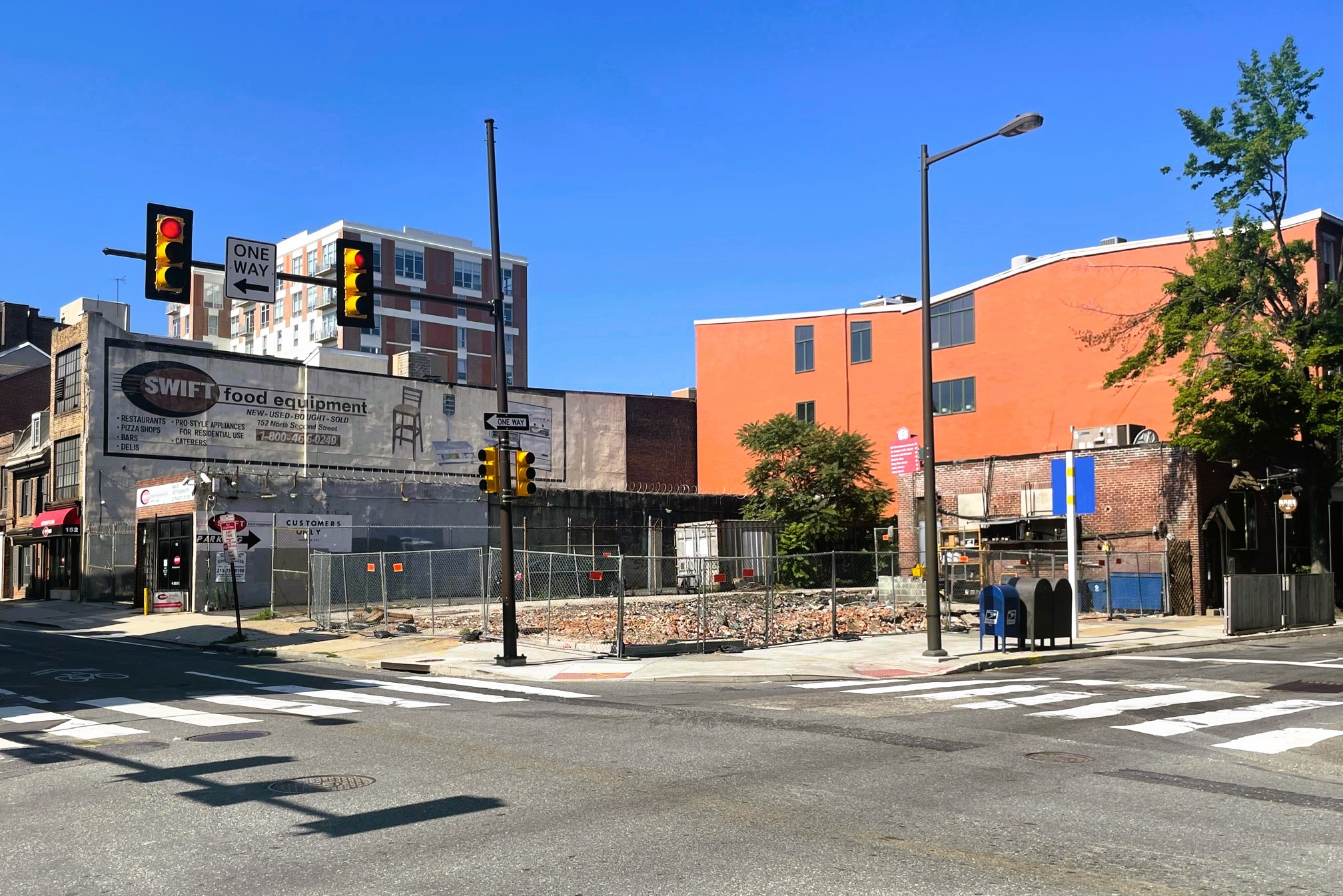
It was less than a month ago when we returned to 160-64 N. 2nd St. in Old City, when new plans were revealed for the corner of 2nd & Race, which has had plenty of proposals over the years. When we last checked in, plans were still being finalized after a presentation to the Architectural Committee of the Historical Commission were not approved due to a few design concerns from the committee. While we liked the design then, we like it even more now, after BVG Property Group and M Architects made some tweaks. Demolition activity has wrapped up since our last visit, incidentally.
Here’s the side-by-side, to show you the changes between the previous plan and the now approved design.
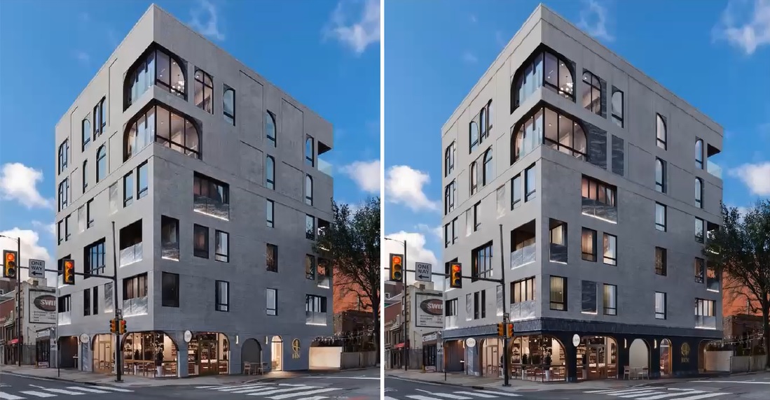
The design team made numerous changes after receiving feedback from the Architectural Committee, including adding a darker brick base to ground the building, while also opening up the windows on the ground floor to give some additional height and scale. The asymmetrical fenestration has been complemented by more marble panels to provide more structure and rhythm to the windows on the upper floors. A new cornice was added about the fourth floor and the large-scale logo on the south-facing facade has been removed. But enough with the talking, let’s see some renderings!
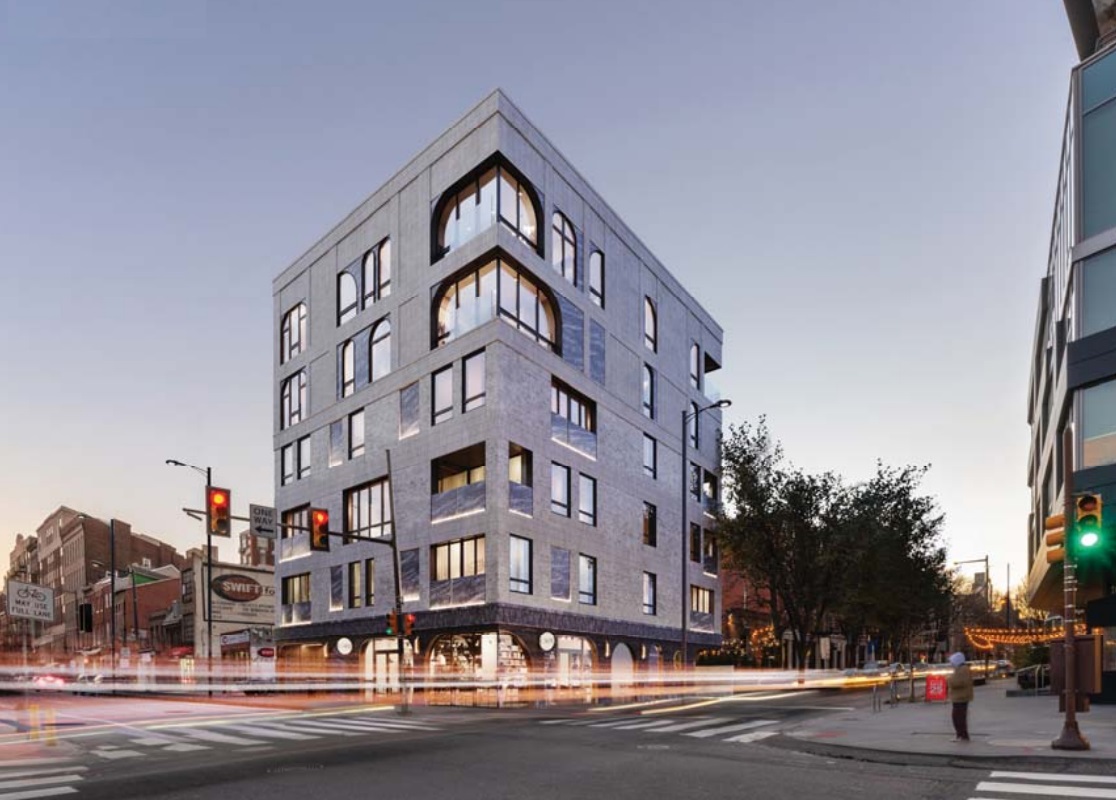
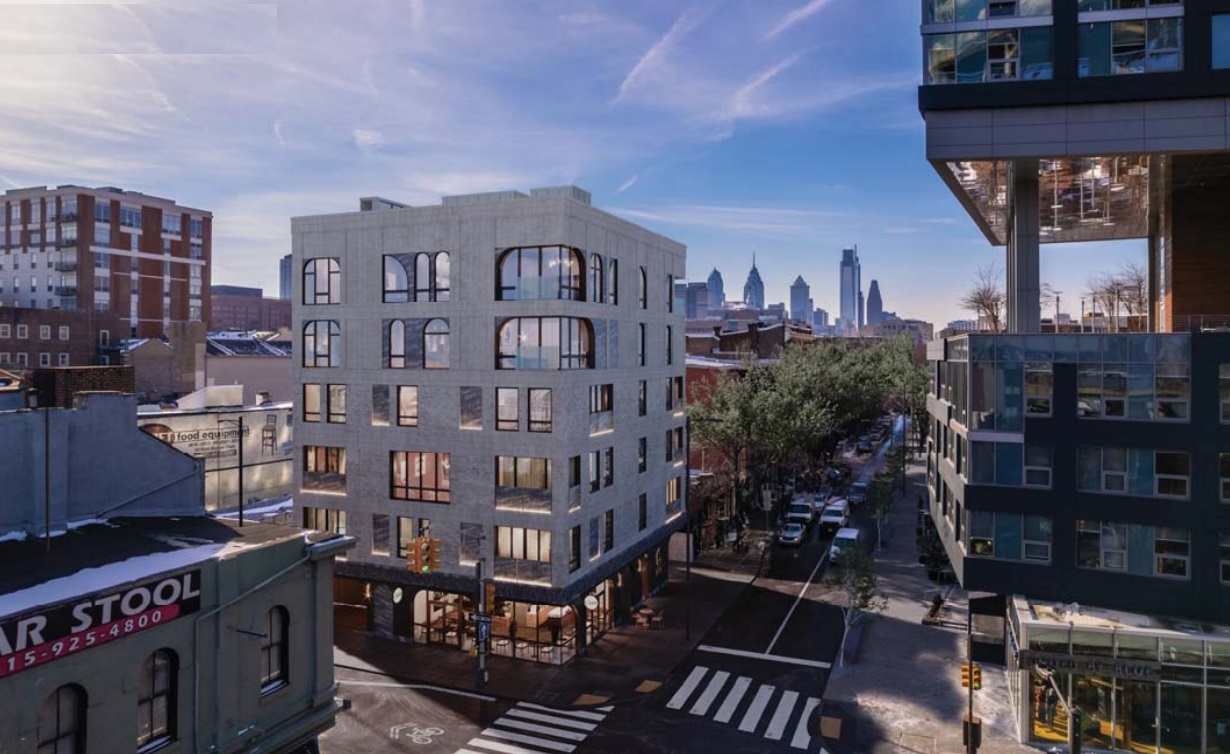
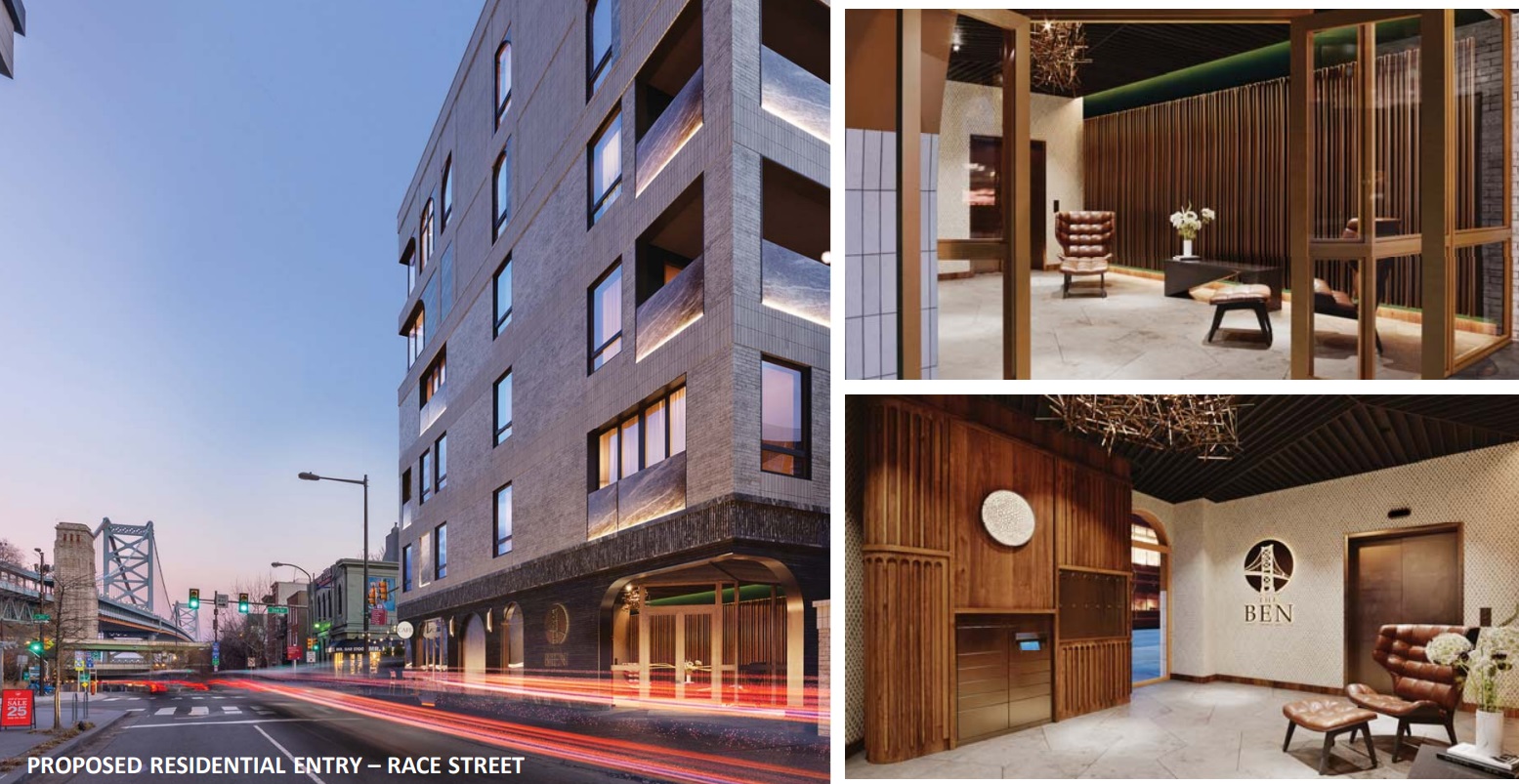

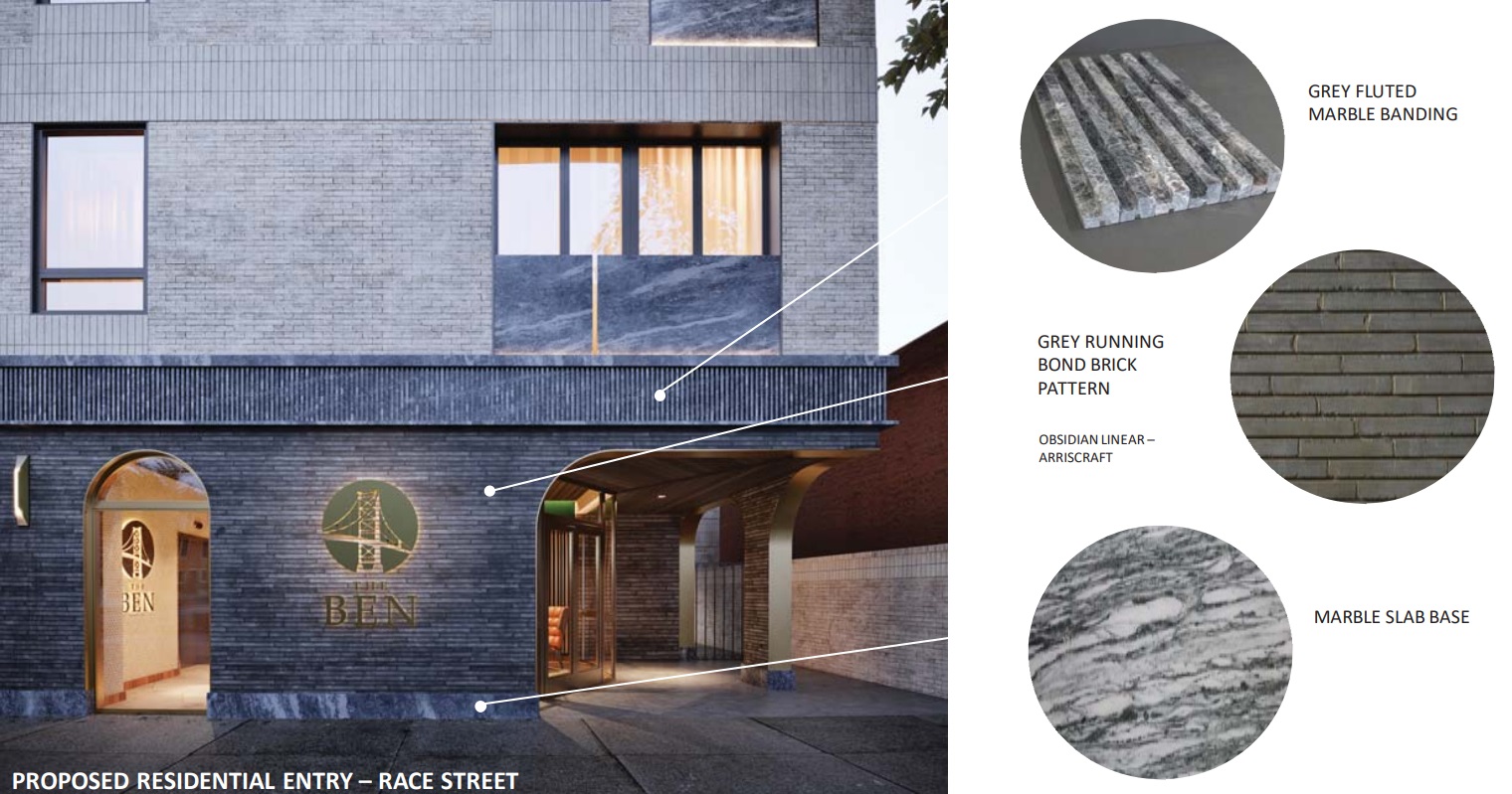
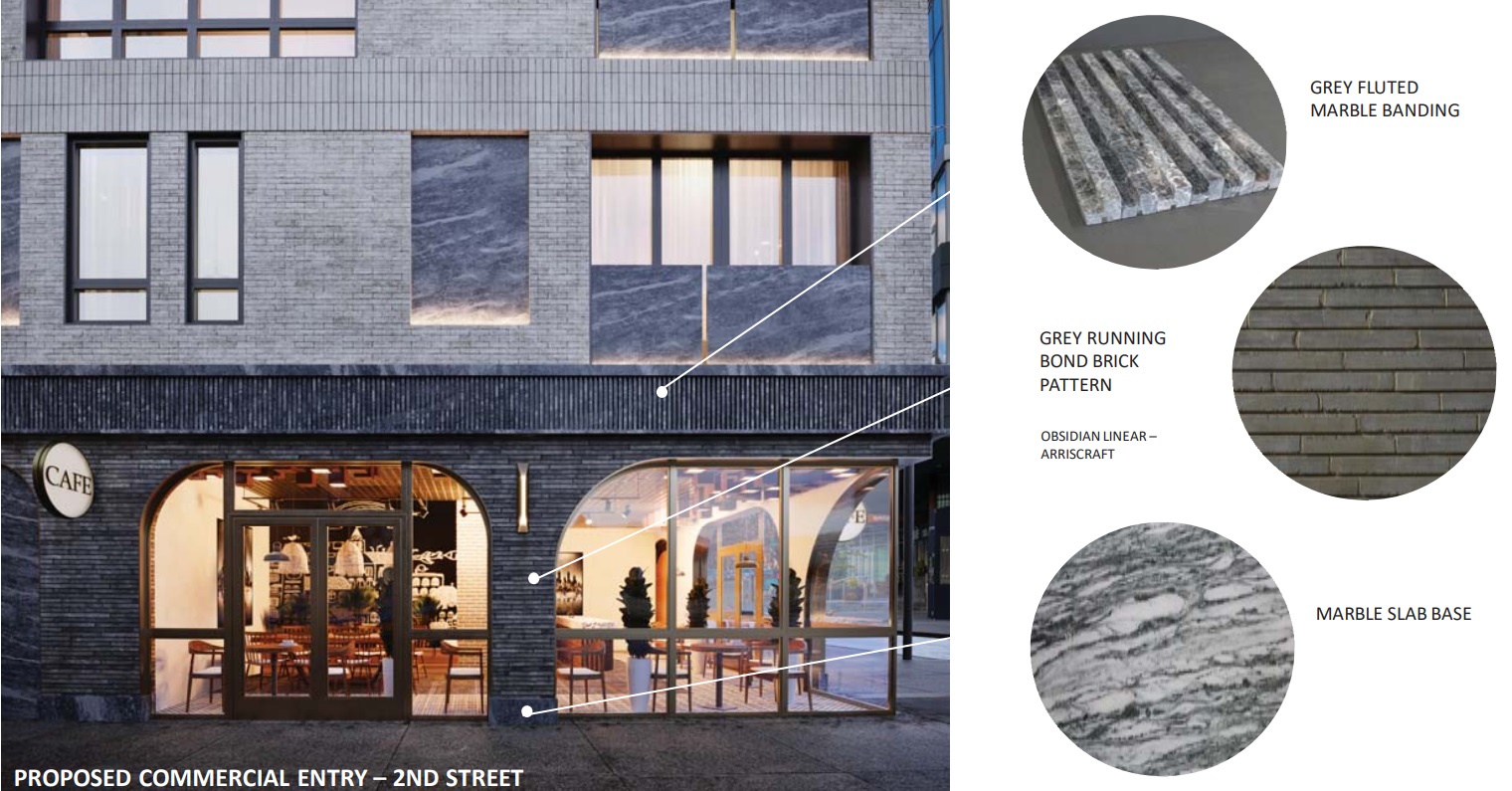
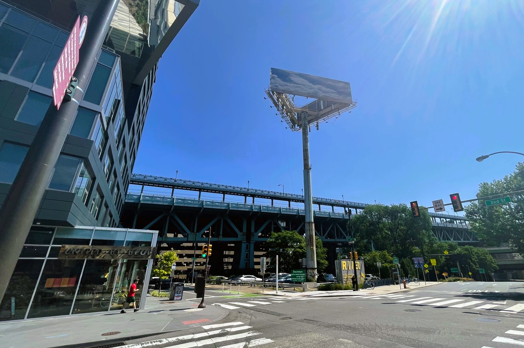
This is an instance where some slight revisions have made a huge impact. We love the darker brick base and how it ties the building together. The addition of the marble panels along the facade is also an interesting, classy touch that makes the design feel more cohesive. Look for a slight reduction in the cornice height, but otherwise this six-condo project should move forward soon in this current iteration. And who knows? Perhaps it will even encourage the owners of that pesky fake-sky billboard catty-corner to this to make a move in the near future. We won’t be holding our breath on that one, though.
Leave a Reply