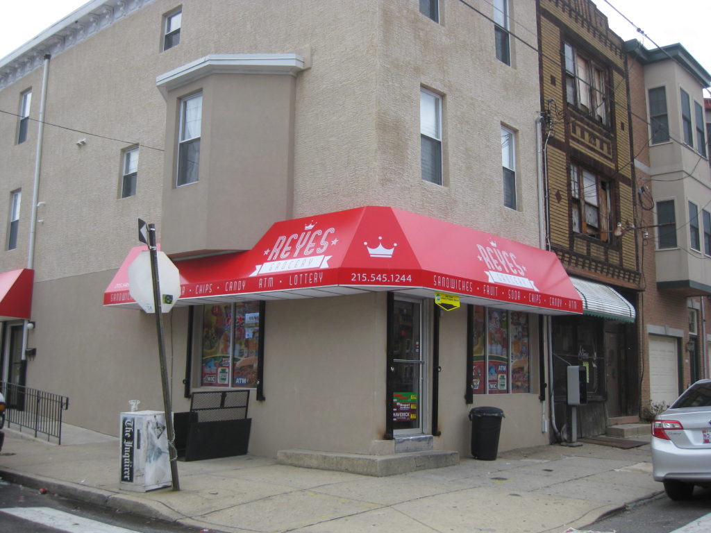
Over the summer, a new corner store opened on the corner of 20th & Carpenter, and soon after put up some signage that could generously be described as incredibly ugly.
Near neighbors, offended by the sight of the signs on a daily basis, worked with the owners of the corner store to work toward a design that would be just effective in promoting their business and perhaps a little easier on the eyes. And with the proper spelling of the word “sandwiches.” About a month ago, the new signs went up.
These new signs, designed by Chris Fernandez of 5to8, are quite an improvement, if you ask us.


Leave a Reply